

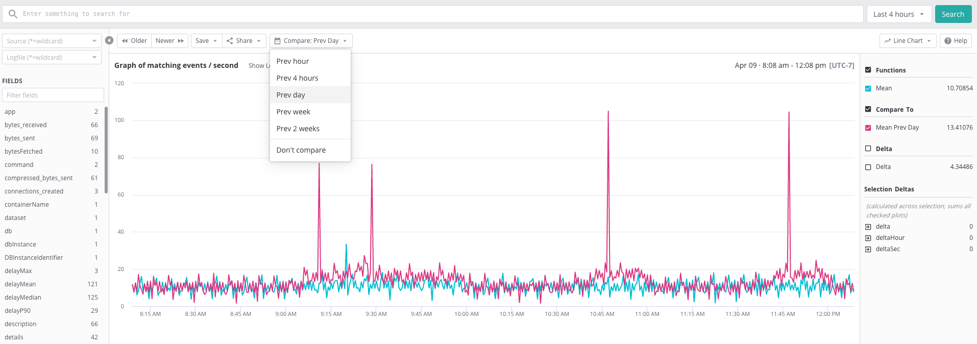
A comparison graph has been supported on the search page for a long time. This type of graph is convenient for comparing the present value with the value from the previous days or weeks.
This same feature is now available for the dashboard too. We recently introduced a new timeshift operator as a way to shift the original query time range within complex expressions.
Let's use the log volume dashboard to demonstrate how timeshift works. First, navigate to the log volume dashboard and click on "Add Graph". I set the name of the graph to "Log Volume Trend" and create three plots on the graph.
- log volume today
mean(value where tag='logVolume' metric='logBytes')
This plot shows the mean value of log volume in bytes.
- log volume timeshifted
mean(value timeshift 1d where tag='logVolume' metric='logBytes')
This is the timeshifted plot that shows the log volume during the same time range from 1 day ago.
- log volume diff
mean(value timeshift 1d where tag='logVolume' metric='logBytes') - mean(value where tag='logVolume' metric='logBytes')
This last plot shows the differences in log volume in bytes between yesterday and today.
After saving the config to the dashboard, my "Log Volume Trend" graph shows 3 lines for the three district plots.
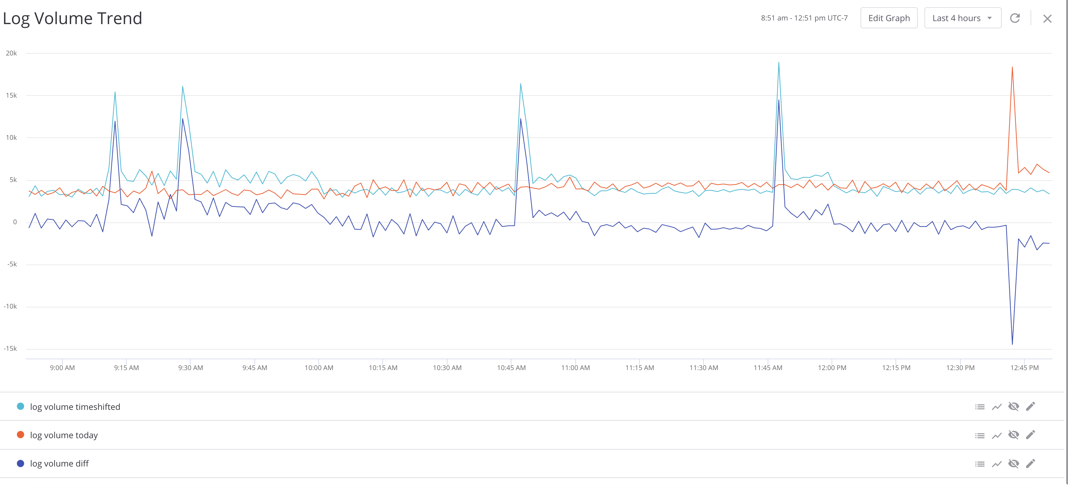
Having 3 plots on the same graph is a bit redundant, so you should probably keep just one plot "log volume diff" since it offers pretty much the same information.
Note that the alerts support similar functionality using an alert-specific syntax.
Old syntax: mean:5m:1w(bytes where path == '/home') < 100
New syntax: mean:5m(bytes timeshift 1w where path == '/home') < 100
Both syntaxes will remain valid for alerts. When the new syntax collides with the old syntax :
mean:5m:1w(bytes timeshift 1w where path == '/home') < 100
This will result in an alert to query the time interval by two weeks.
Comments
0 comments
Please sign in to leave a comment.